
Payments for Remote Retail Vehicle Service
Remote service payments had to be designed inside a fragmented, high-risk technical ecosystem that undermined consistency and trust.
Ford’s remote vehicle service payments were supported by a complex mix of dealer management systems, legacy internal tools, and third-party payment processors. Workflows varied widely by dealership and often relied on manual handoffs, phone calls, or ad-hoc links, creating friction for customers and operational risk for service teams.
From a UX standpoint, the challenge was not simply simplifying payments, but designing a reliable experience that could function across disconnected systems—many of which were outside Ford’s direct control.
A standardized remote payment experience built to withstand system variability and platform transition.
I led the design of a remote payment experience that enabled technicians to generate secure payment requests while providing customers with a clear, trustworthy way to review and complete payment remotely. The experience aligned with Ford’s broader ecommerce patterns while remaining flexible enough to accommodate dealer-level variability and an evolving payment infrastructure.
The solution intentionally balanced near-term feasibility with long-term scalability, ensuring the UI could survive beyond the pilot without frequent redesign.
A service-design-led approach grounded in user needs, system realities, and disciplined decision-making.
This work required aligning customer experience goals with real technical and operational constraints.
Research
Interviews with service managers, technicians, and customers revealed that payment friction was often caused by system gaps rather than user error. Participants described uncertainty around payment status, lack of confirmation, and improvised workarounds that increased risk.
These findings reframed the problem from “improving checkout” to “creating clarity and trust across disconnected systems.”
Analysis & Journey
Journey mapping intentionally included backstage systems and ownership handoffs, surfacing where technical constraints directly affected the customer experience. This analysis clarified which moments required UX intervention versus operational alignment.
Three distinct payment moments emerged, each with different constraints—making it clear that a single, rigid solution would fail.
Solution Definition
Cross-functional workshops were used to define requirements, constraints, and success criteria. Prioritization balanced accessibility, dealer adoption, future processor changes, and engineering feasibility.
Design decisions were made explicitly, with an understanding of where the experience needed to be opinionated versus adaptable.
Designing a resilient UI within a shifting payment infrastructure required deliberate trade-offs.
The remote payments solution needed to support three primary audiences — customers, technicians, and dealers — each interacting with the system through different tools and constraints. Customers required a simple, trustworthy way to pay remotely, technicians needed fast and reliable methods to initiate and track payments, and dealers depended on accurate reconciliation within existing systems.
Rather than forcing these audiences into a single interface, the experience was designed around a central payments ecosystem. Payment links and transactions flowed through a hub that connected customer-facing pay-by-link experiences, a technician-facing native app for card-present payments, and dealer management systems responsible for repair orders and reconciliation.
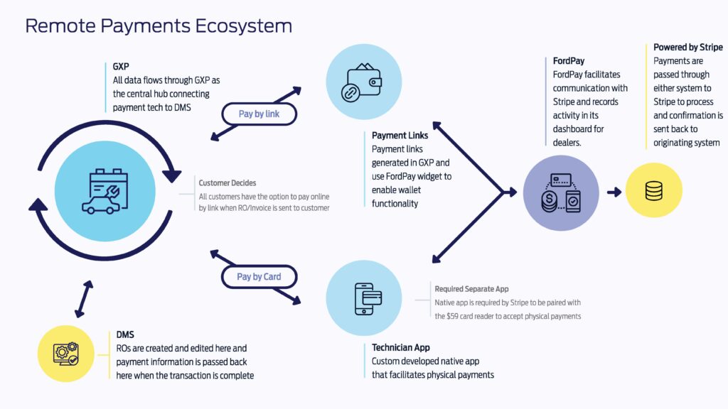
This architecture introduced real UX constraints: interactions occurred across multiple applications, payment methods, and system states. The design challenge was ensuring each audience had a clear, role-appropriate experience while maintaining consistent expectations around payment status and confirmation.
To address this, the UI focused on predictable interaction patterns and shared mental models, allowing the experience to feel cohesive even as it spanned multiple platforms and technologies.
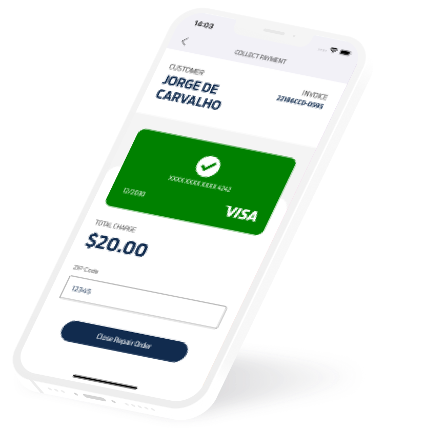
Moving from approval to build while protecting the pilot from platform change, timing pressure, and scope risk.
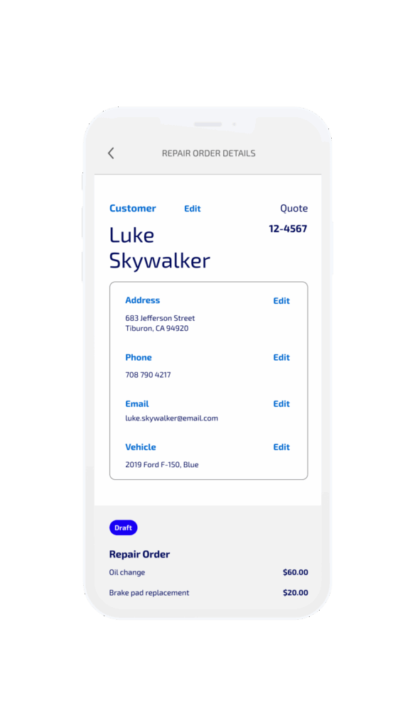
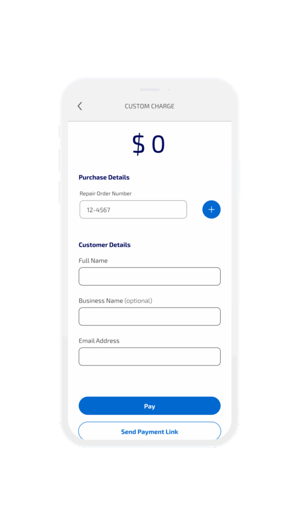
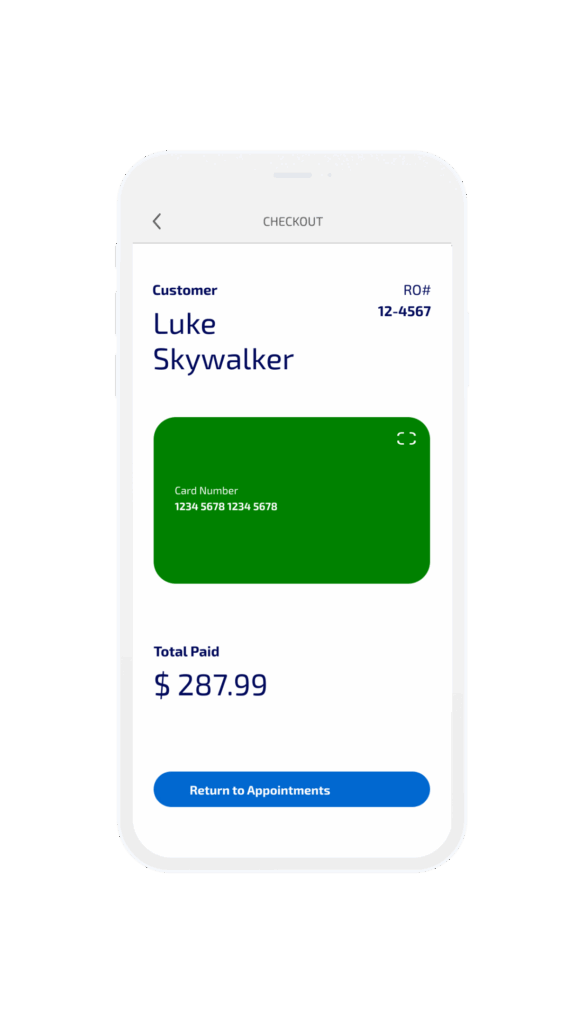
Once the experience direction was approved, interactive wireframes became the contract between design and engineering, allowing development to begin. At this stage, the work shifted from exploration to execution, with a focus on preserving UX quality under real delivery constraints.
Midway through build, the scope expanded when it became clear the application would need to outlast the pilot and function as a production-ready tool. This introduced new timing and budget implications while development was already underway.
My role during this phase centered on decision-making: determining where to harden the design, where to remain intentionally simple, and how to insulate the pilot from broader system and design-system changes occurring in parallel.
Designing through a technology changes without destabilizing an active pilot.
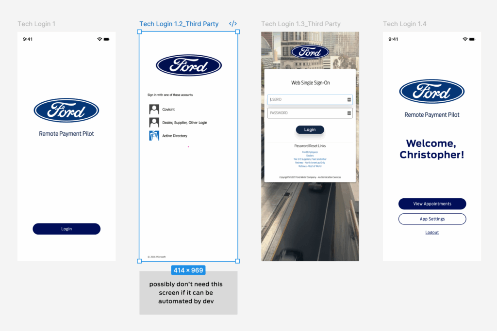
As Ford transitioned from FiServ to Stripe, backend capabilities and requirements shifted while the pilot timeline remained fixed. Delaying launch was not an option.
I made the call to complete UI design and initial feature development in parallel. This allowed engineering to build without waiting for design approvals. Only the very first test transactions were completed in an unstyled app.
This decision preserved schedule, reduced risk, and avoided duplicative design and development effort.
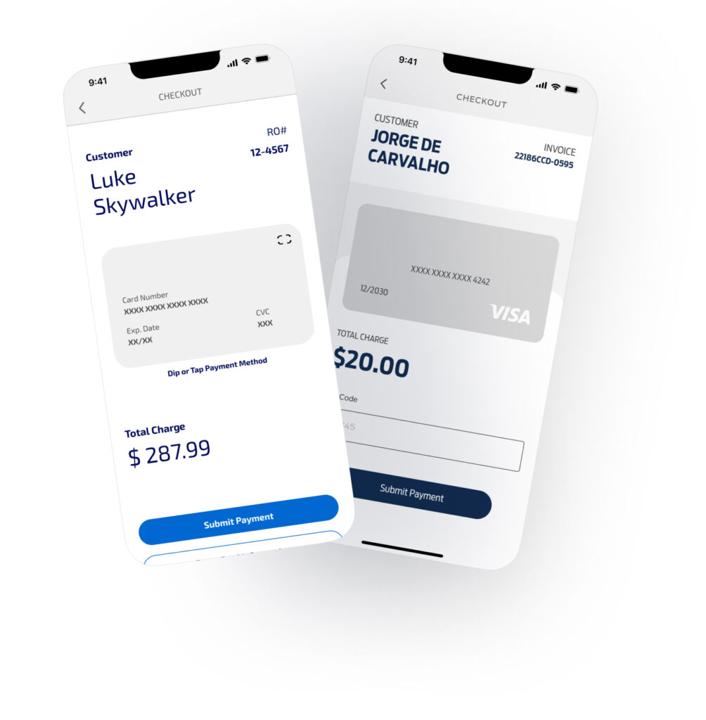
Balancing short-term validation with long-term product expectations.
Although initially scoped as a limited pilot, early adoption demonstrated high user demand. It was discovered that a native app was required to accept tap to pay – there was no way to integrate that into a web app. At the same time, leadership required the app to meet production standards without resetting timelines.
Rather than expanding scope or building toward a known redesign, I guided the team to create new features using the new customer-facing UI that was rolling out — this generated a temporarily inconsistent appearance, but limited the screens requiring rework to the few included in the first feature launch.
Interaction design decisions reduced error, reinforced trust, and translated system complexity into clear user feedback.
The strategic thinking carried through into UI design decisions and my vision was brought to life by a pair of UI designers.
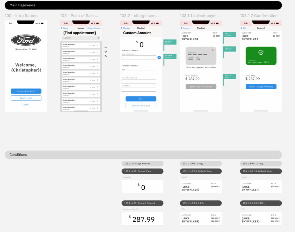
Expanded designs are viewable in Figma.
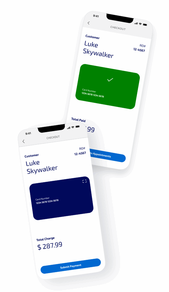
Guided card entry using visual structure and color cues
The credit card entry pattern was intentionally designed to mirror a physical card, using layout and color to guide accurate data entry. Visual grouping and subtle color cues helped technicians and customers understand where to enter information and when input was valid, reducing reliance on error messages or instructional copy.
This approach provided immediate, non-verbal feedback, supporting faster entry and fewer mistakes in high-pressure or in-field scenarios.
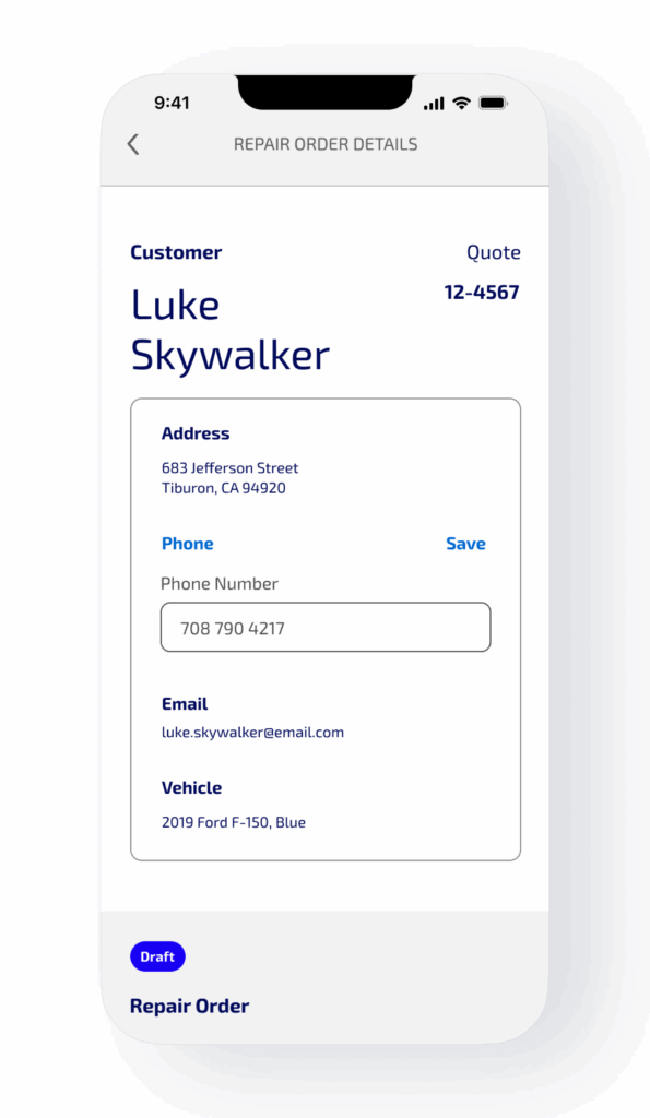
Explicit and implicit edit triggers to prevent accidental errors
Customer information could be edited using both clearly labeled edit actions and expected “tap-to-edit” behavior on form fields. This dual-mode interaction acknowledged different user habits and reduced the risk of users overlooking editable fields or unintentionally submitting incorrect data.
By combining explicit controls with familiar implicit interactions, the UI minimized friction without introducing ambiguity.
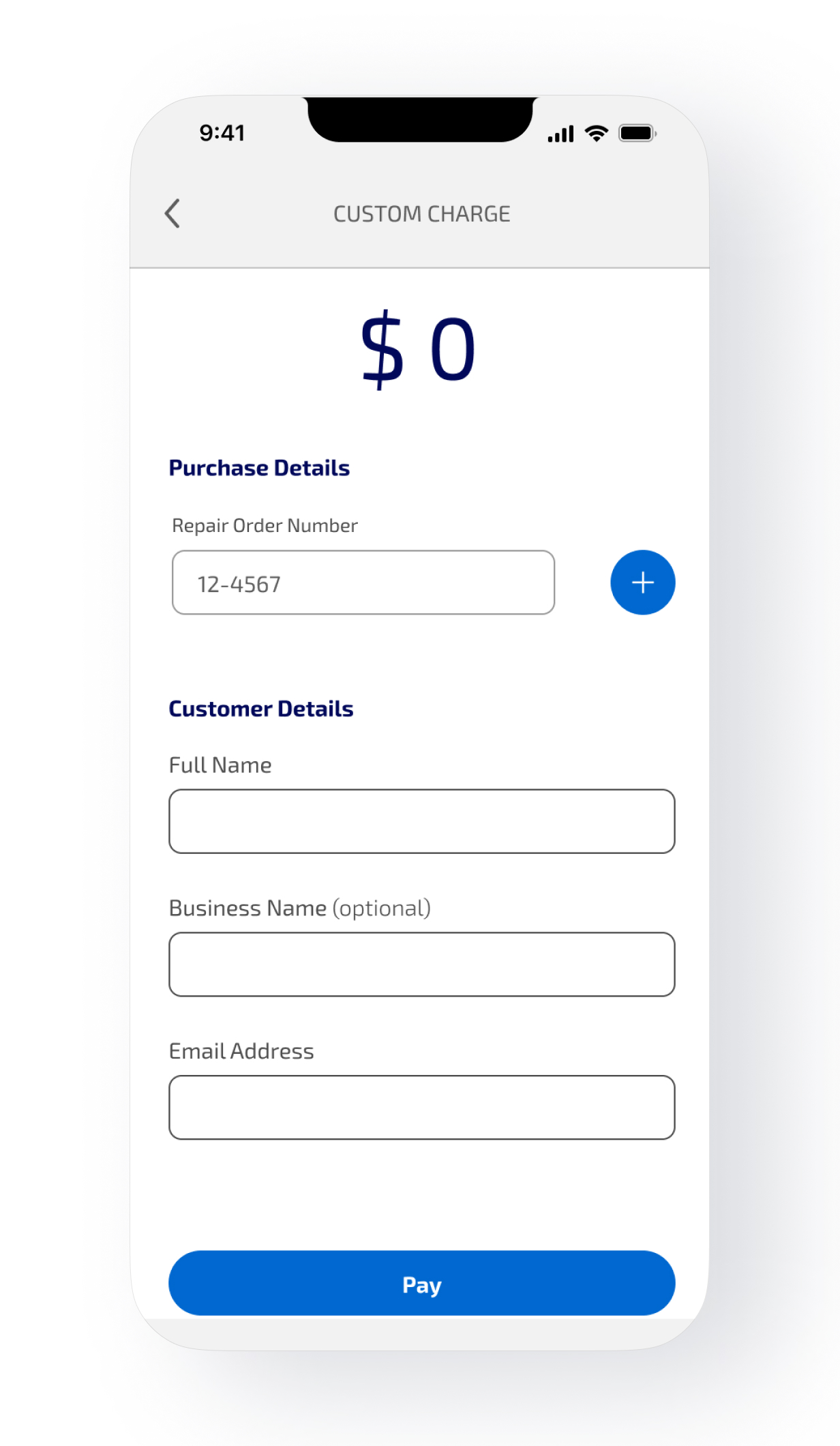
Function and clarity were prioritized over moments of delight
Because payment state was determined by multiple systems, the UI had to work for speakers of 4 different languages at launch, with no additional language support. A clear, simple UI was chosen.
Large buttons, well-defined fields, and standard interactions ensured the app could be used by technicians and customers alike without training or practice.
This pilot validated both the experience and the underlying design strategy.

Dealership adoption increased as the tool proved reliable across diverse environments. Customer satisfaction scores increased by 143% when remote payment was used. More importantly, the experience held up through backend change and expanded expectations, validating the decision to prioritize resilience over feature density.
The project influenced how all future service payment tools will function and replaced planned point-of-sale checkout development, saving cost and time.
Project Details
Role
Experience Design Associate Director
UX Designer
Client
Ford
Team Members
Experience Strategy: Marli Thurow
UI Design: Staff UI designers @ VMLY&R
Process & Methodologies
CX / Service Design
Brainsteering
Ideation Workshops
Customer Journey Mapping
User Research
Role playing
