
Huggies Mobile Optimization
Problem
Huggies’ main website was nearly launched with updated branding when the team brought issues with the existing mobile navigation interactions and registration modal to the team.
Solution
UX was brought in to solve the mobile navigation problem and solved the fall-off for mobile rewards program registration with clear, direct interactions, single action buttons and improved copy.
Approach
I worked with the creative director who had designed the initial reskin and the clients to understand what was possible within budget and time restrictions.
I identified 2 key problems – a bifurcated interaction in the navigation and combining the sign-up and login into one modal and always defaulting to login when launched.
Designs
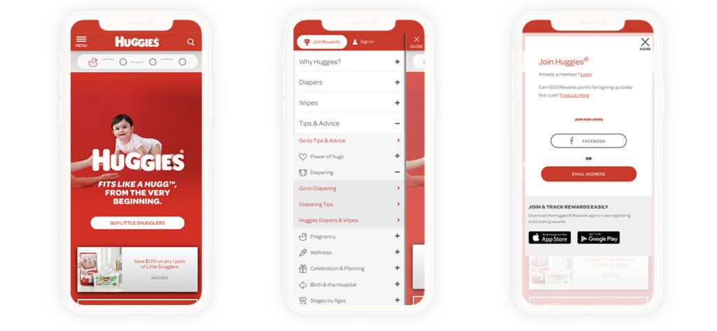
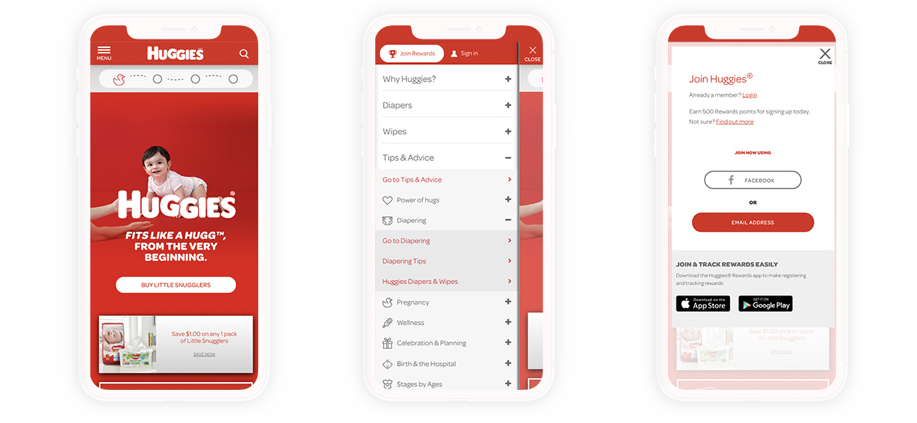
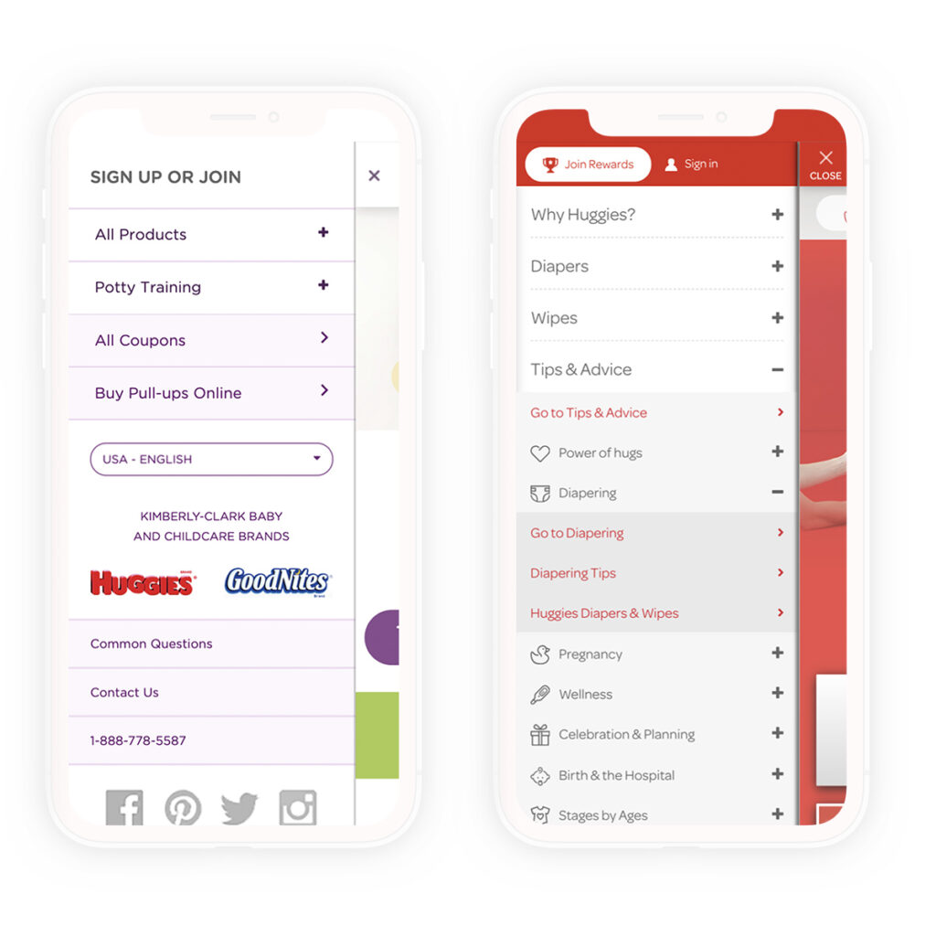
For the mobile navigation, the original layout had bifurcated links and unclear boundaries. Users weren’t sure if they were clicking to open a page or to expand navigation.
Navigation was updated so that each button was clear – if there was a category with sub pages, an item with a plus opened & closed the group and the topic page and sub pages were listed separately.
This had a minor decrease in pages per visit, but increased time on site by 45 seconds and NPS scores by 17% meaning users were finding relevant content more quickly.
You can also notice that sign up and join were turned into 2 different links with join prioritized, this affects the modal experience that follows.
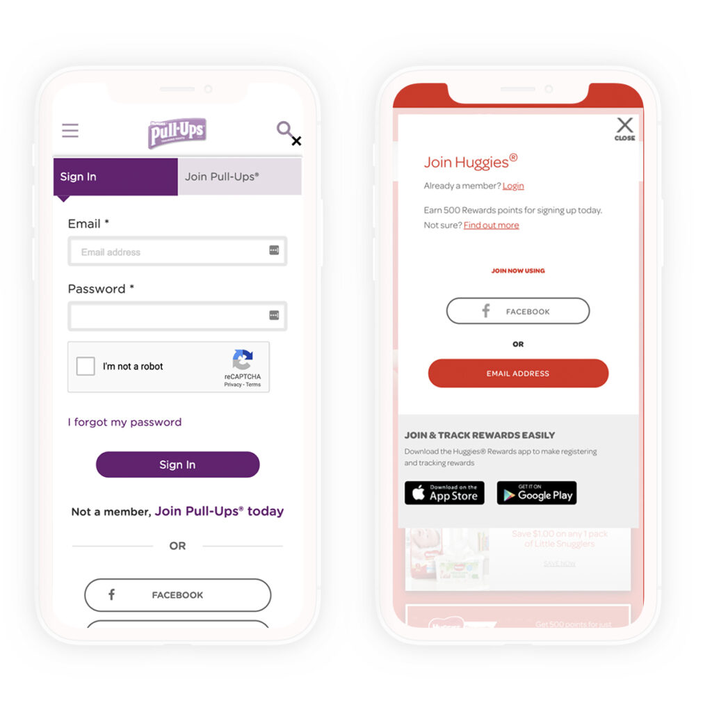
The rewards program modal had multiple issues due to overdesign. The first change was to allow users to choose to sign in or register before opening the modal. This ensured that the action they wanted was the one prioritized in the modal, while a link was still available to switch if they chose incorrectly.
Facebook login was prioritized because it was the highest-converting registration method, while others, such as Twitter, had declining conversion rates. Presenting a button without form fields helped reduce perception of complexity for users registering for the rewards program.
The optimizations also allowed the app links to be visible on screen without scrolling.
Mobile registrations increased 36%, and app download link conversions increased 147%.
Project Details
Role
UX & UI Art Director –
Client
Huggies
Project URL
http://huggies.com
(no longer live)
Team Members
Creative Director: Susie Jendro
Process & Methodologies
Wireframing
Interactive Prototyping