
Cox Flexible Shopping
Design Sprint
I led a design sprint to define and draft a shopping checkout process that delivered on the promise of shopping without restrictions. We defined all decisions in the purchase journey and identified which of those were part of the shopping experience and which were part of the checkout experience.

Hub & Spoke Architecture
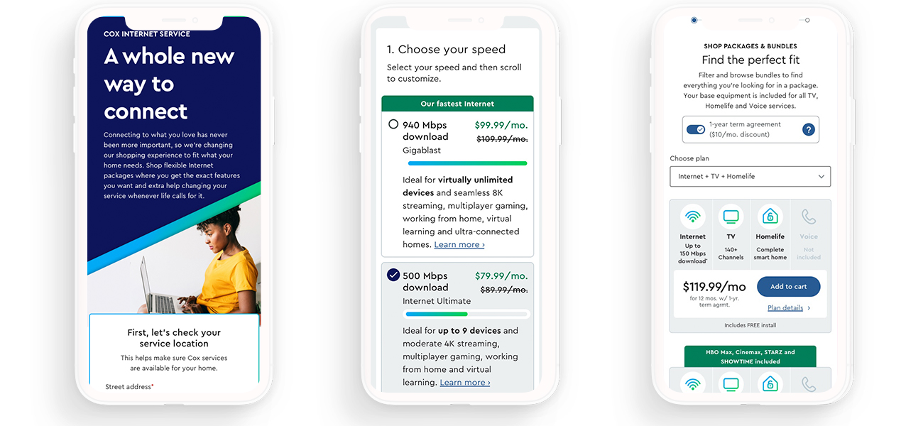
Using the inputs from our client sessions, we had rapid design sessions each day to work towards a way to shop. We designed a mobile-first hub & spoke checkout. Focusing on a single product at a time reduces user frustration, lowers cognitive load and improves accuracy. It also allows users to only explore the products they wish to purchase.

Pricing Cards
One of the most complicated parts of the Cox website are the pricing cards. These components display dynamic pricing, personalized offers and key features. We vary the design according to the number of products being sold together.
Based on A/B test results, we streamlined the content on the card when it loads, but included additional information when the card is “flipped”.
Further testing on these cards is in the works to validate and refine.

Product Pages
As part of the shift in sales, the marketing/product pages needed to evolve to support the new way of buying. We re-worked the designs from the ground up – making both interaction and visual design changes.
In testing we learned that users wanted to see prices and get products in the cart right away, even if they weren’t quite ready to buy.
Adding a product to your cart moves you into the product spoke to customize your plan options – making that transition seamless and low-pressure.

Validation

The hub & spoke checkout stayed largely unchanged from concept to final interfaces., and our experience concludes before payment due to technical restrictions.
A key improvement from site testing results was to include a little product information information in the checkout to help users make choices. We also reduced the prominence of branded terms that didn’t help identify the product (eg using speed to label plans rather than “Internet ultimate”).
Project Details
Role
UX Lead
Client
Cox Communications
Project URL
http://cox.com
Team Members
Creative Director: Patrick Futtner
Associate Creative Director/Lead UI designer: Ben Ludwig
Senior Copywriter: Anastasia Kelly
UX Architects: Anastasia Miranda, Pedro Santillanes
UI Designers: Dan Eggert, Allie Elster, John Hultman, Leslie Hung
Copywriters: Diego Cagara, Jim Choy, Danny Zillmer
Platforms & Tools
Adobe Experience Manager (AEM)
InVision Design System Manager
Custom catalog/checkout